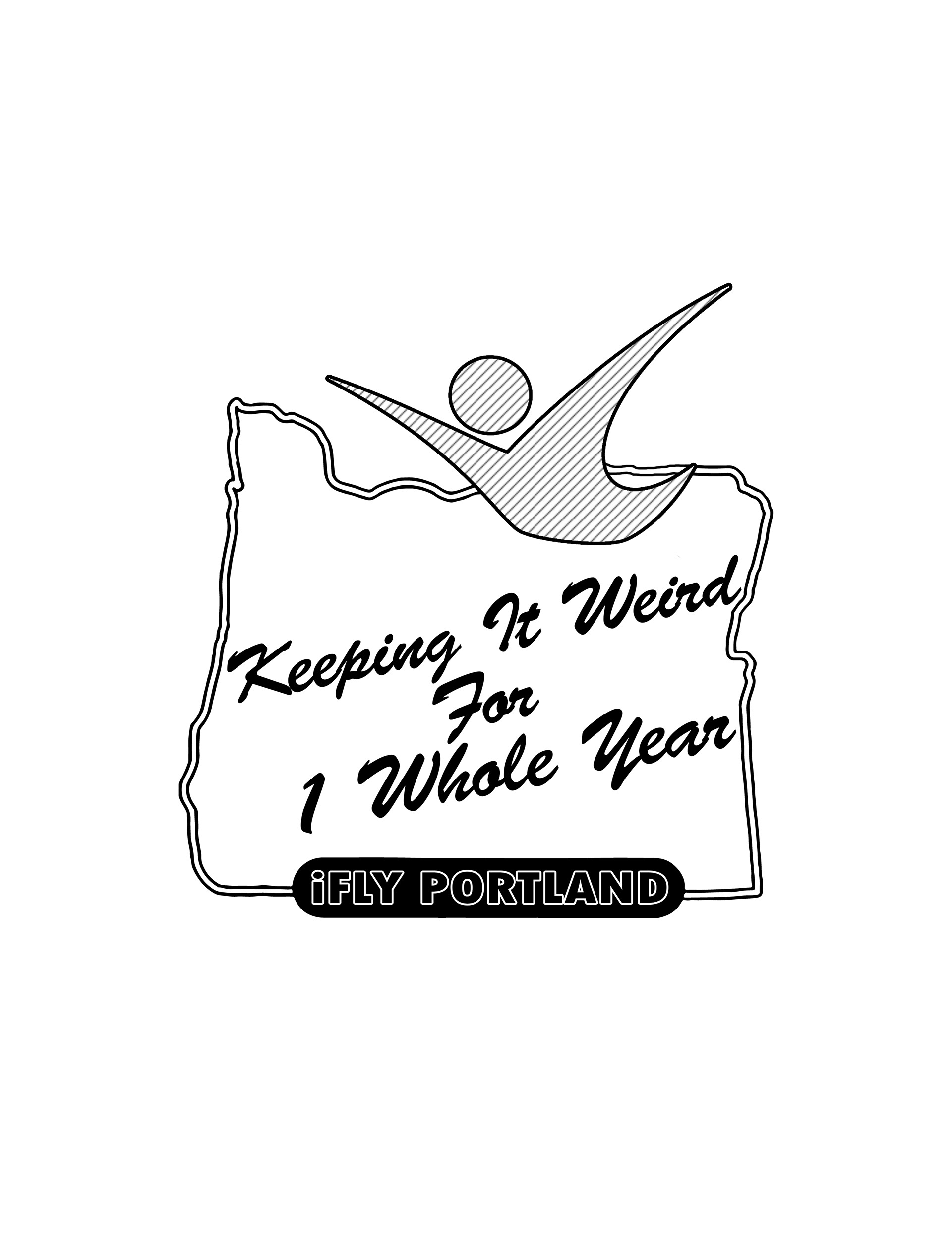
I was asked by my general manager of iFLY Portland to create logos and a simple shirt design or the 1 year anniversary of the tunnel being open. I chose to base the design on one of the most well known neon signs in Portland. I added the iFLY "fly guy" and played around with font and got final approval to send the design to be made into stickers. The shirt for the anniversary started as a tie dye colorful shirt of the building, but due to time and cost became a blueprints inspired blue shirt.
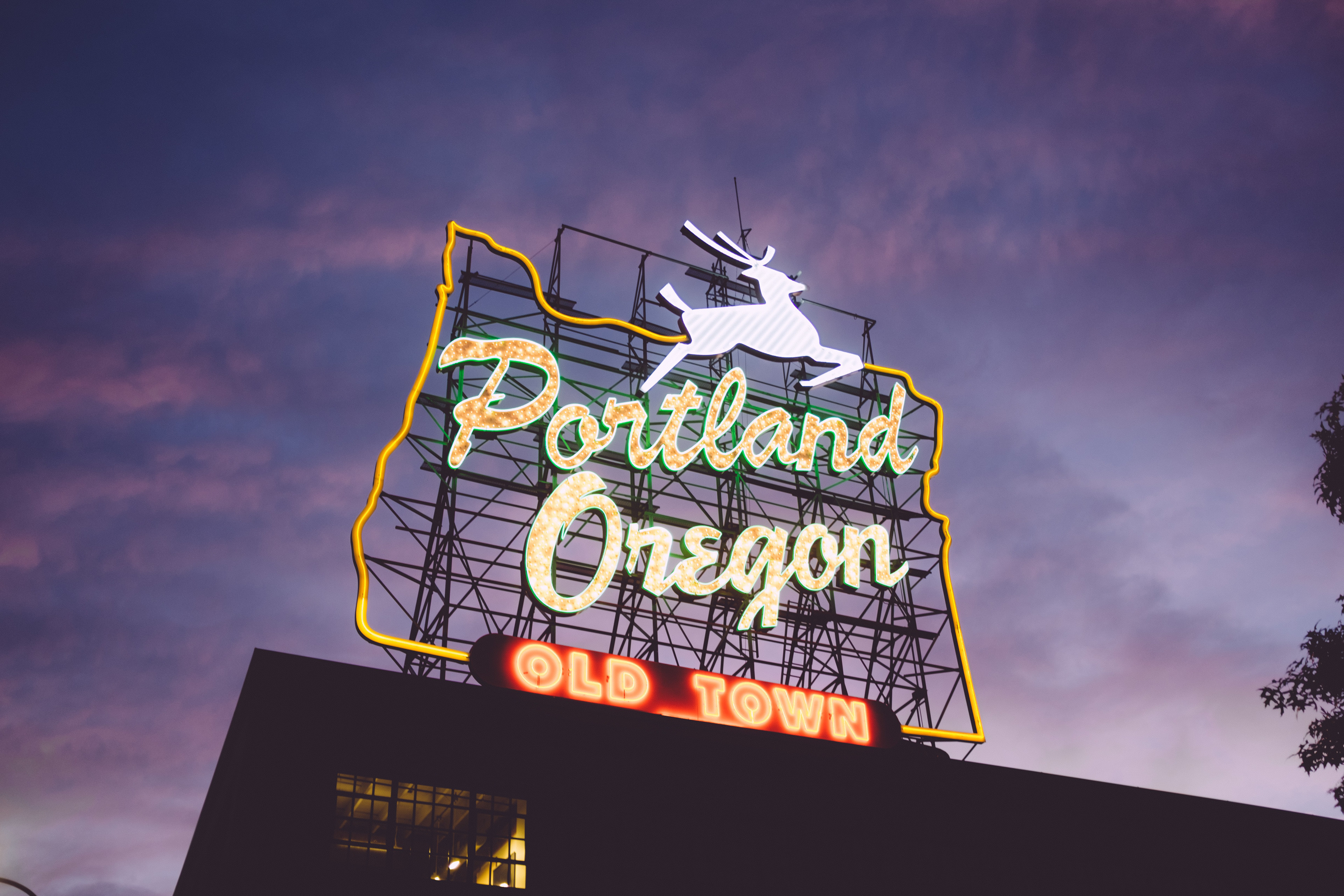
Original photo by Zack Spear
B&W outline
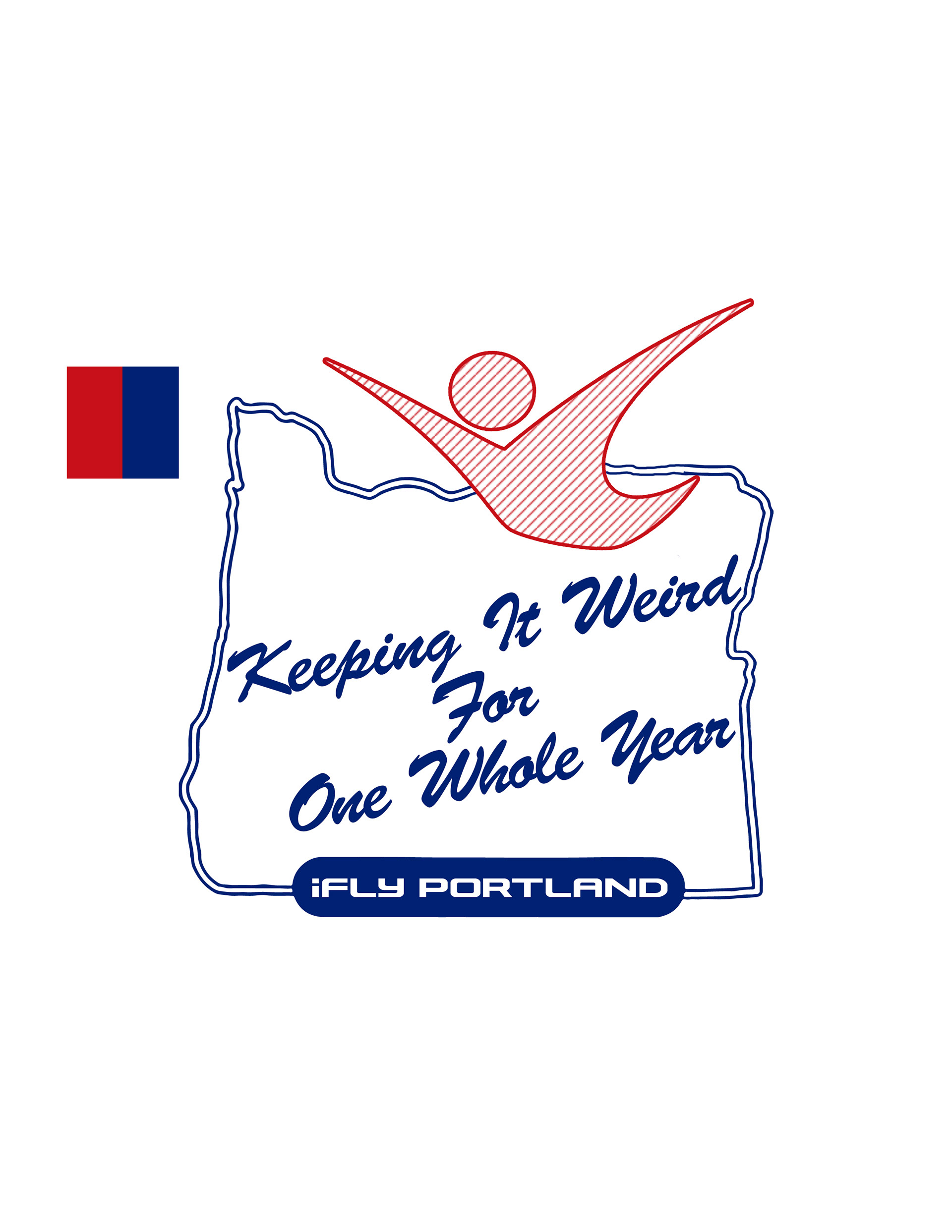
Adding the offical iFLY colors
variation and final version
Reference for font use on shirt original photo by Richard Bendo
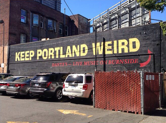
simple building outline with text inspired by the "Keep Portland Weird" wall mural
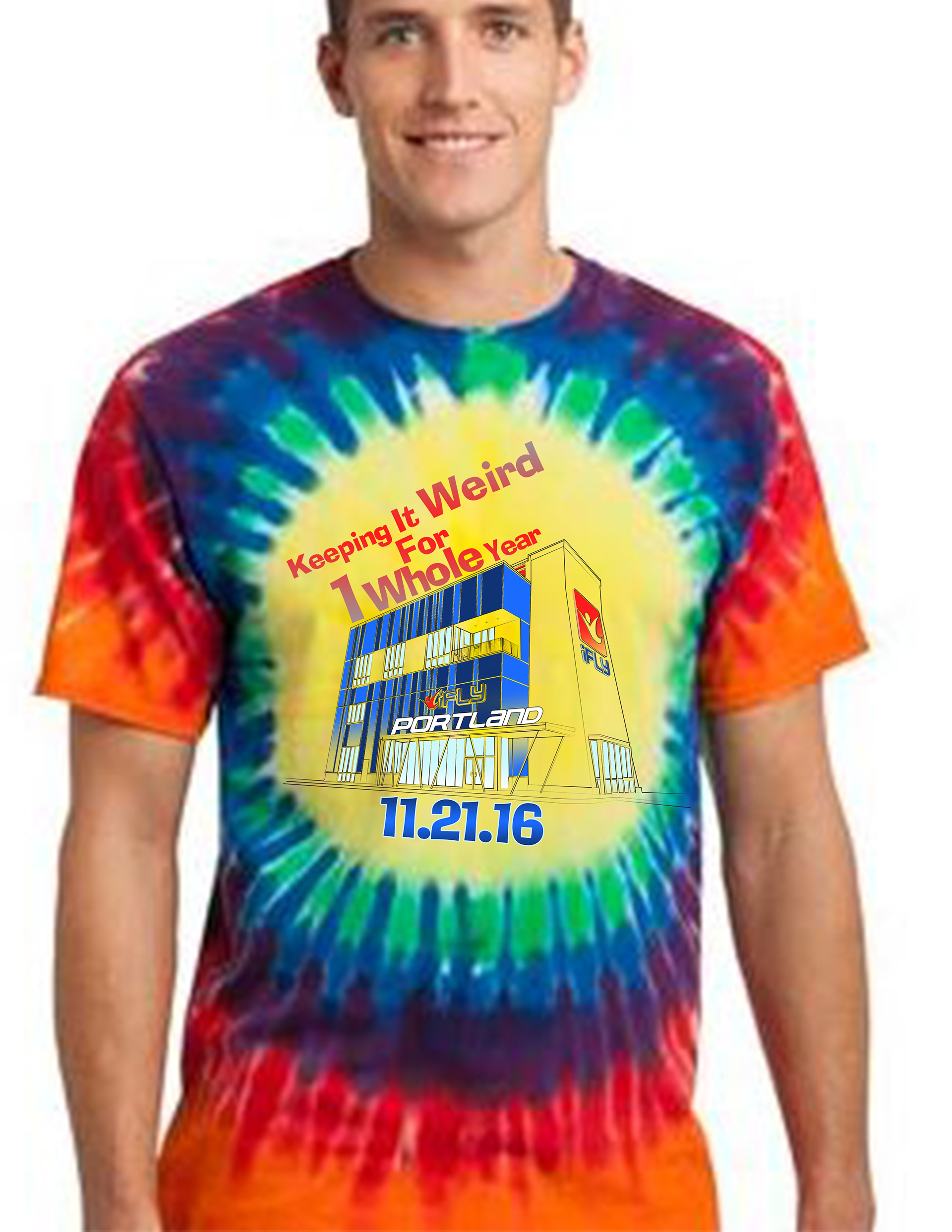
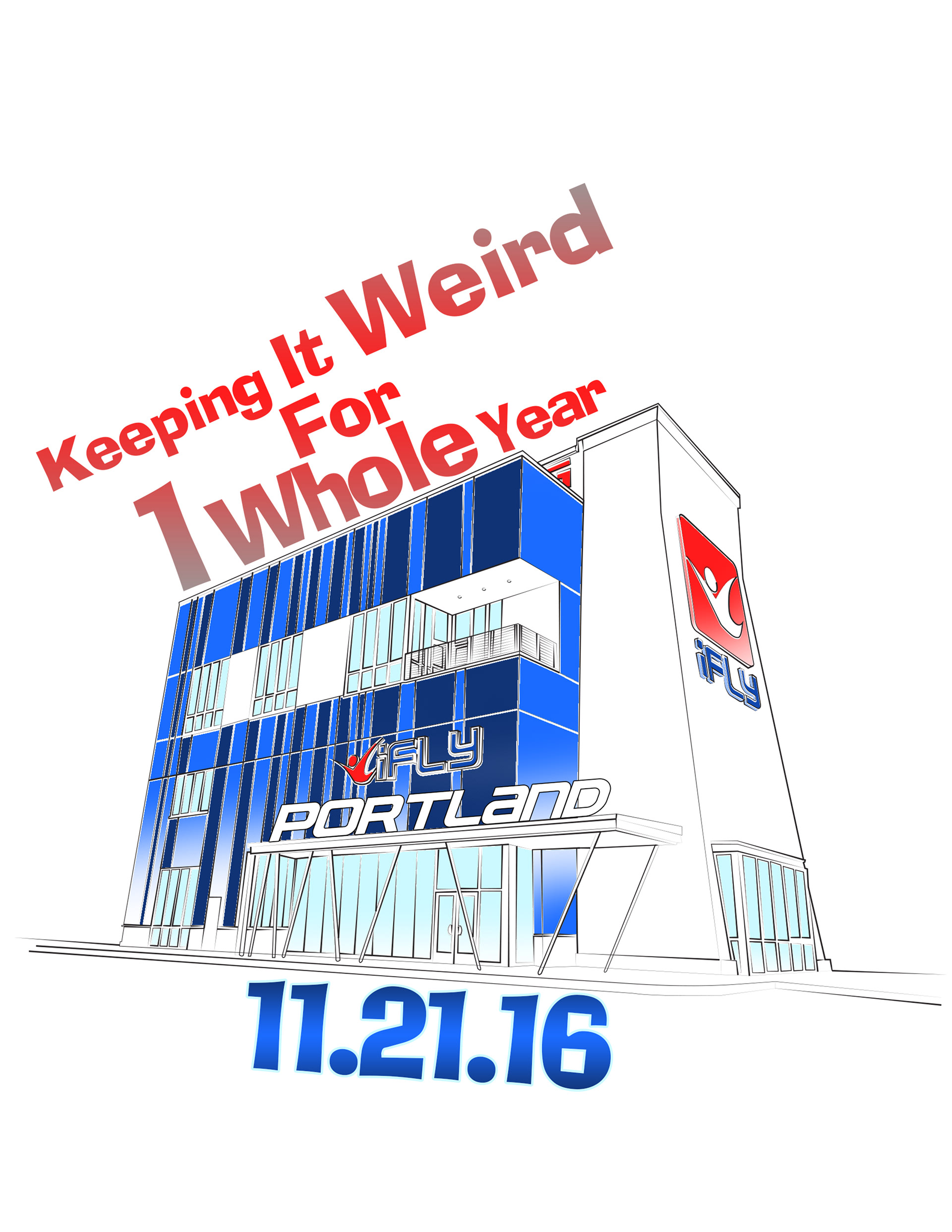
Initial shirt mock up
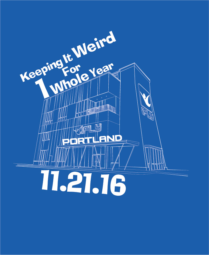
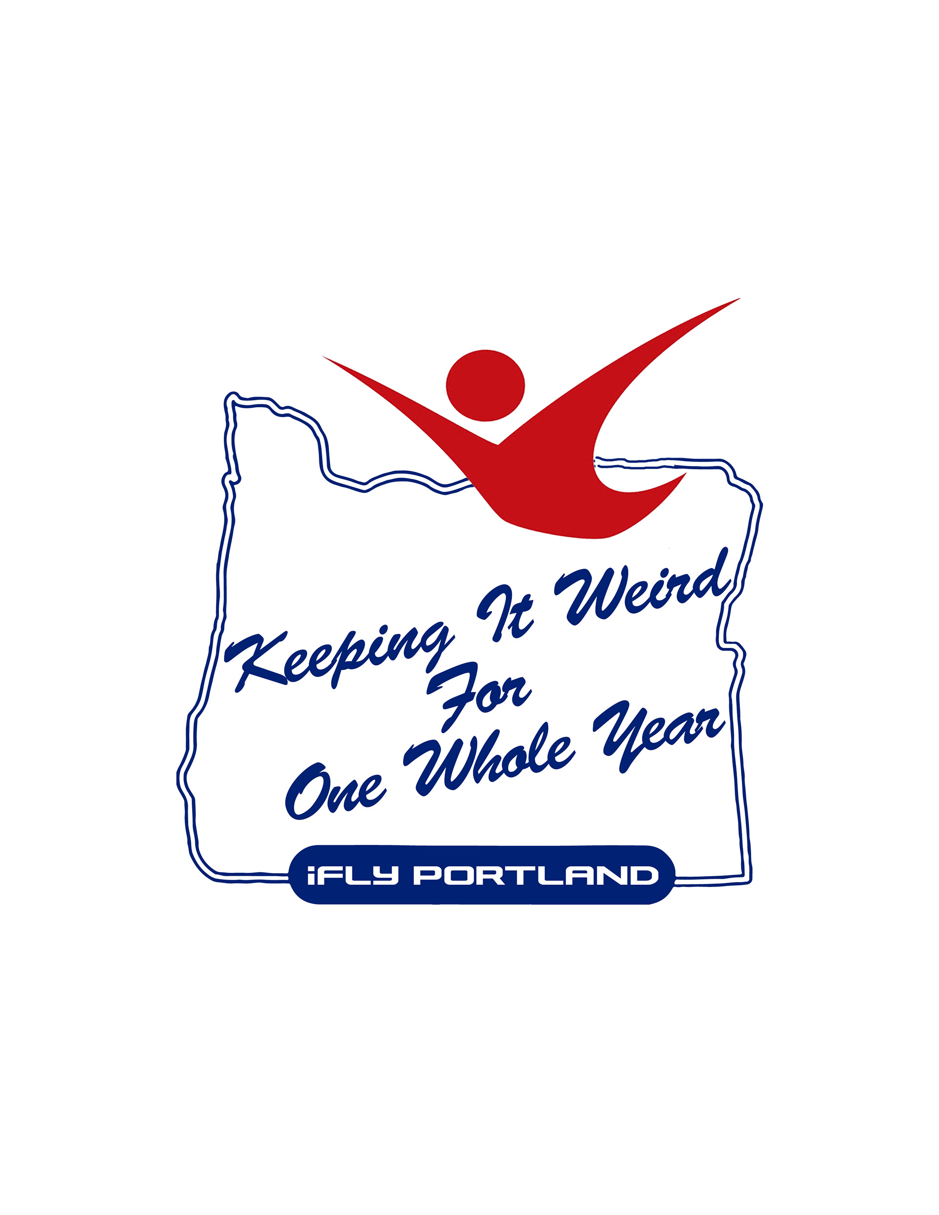
final shirt design with it living on a simple blue shirt
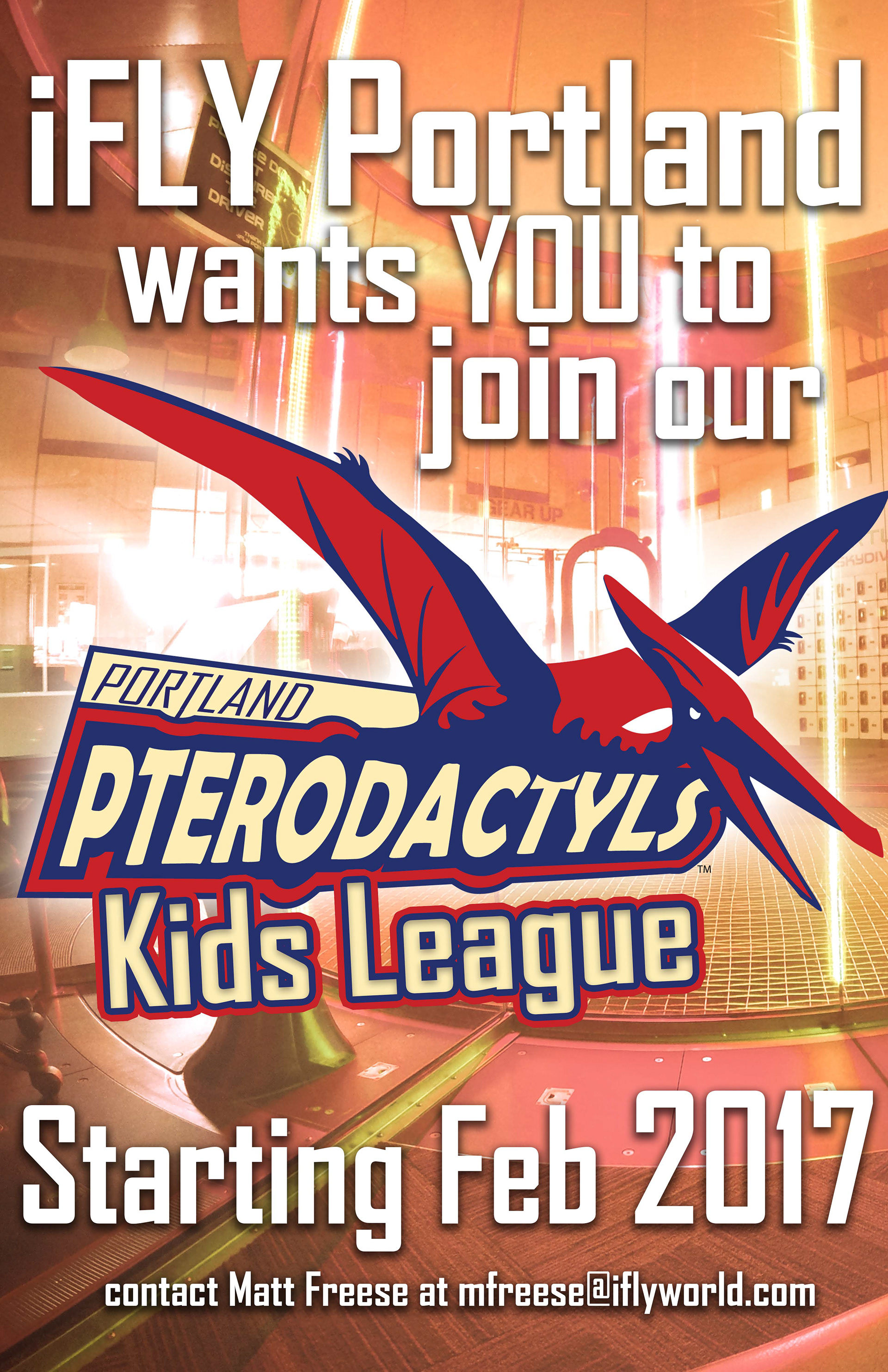
Later in the year I was asked to create a kids league, and with that a kids team for competitions. A fellow shift supervisor wanted a Pterodactyls themed team name and logo to help rally the kids that were registering and participating. Initially the drawings below were considered too cute so I leaned more into the realistic outline in line with a more e-sports feel. The colors are taken from iFLY's official company colors and the logo was printed on posters and handouts.
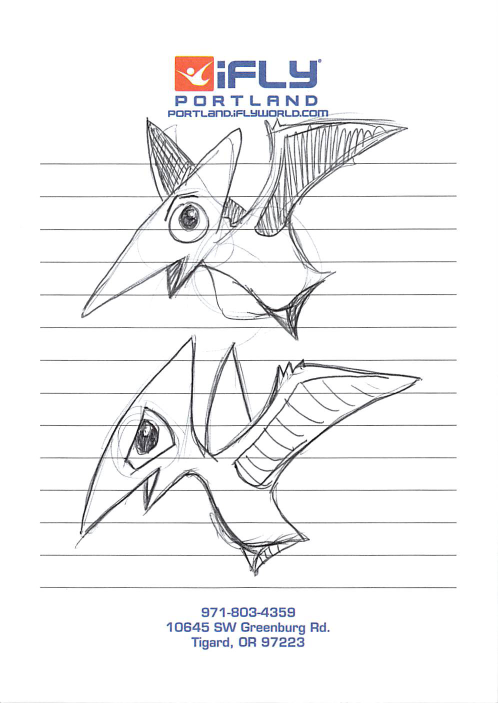
Two too cute pterodactyls
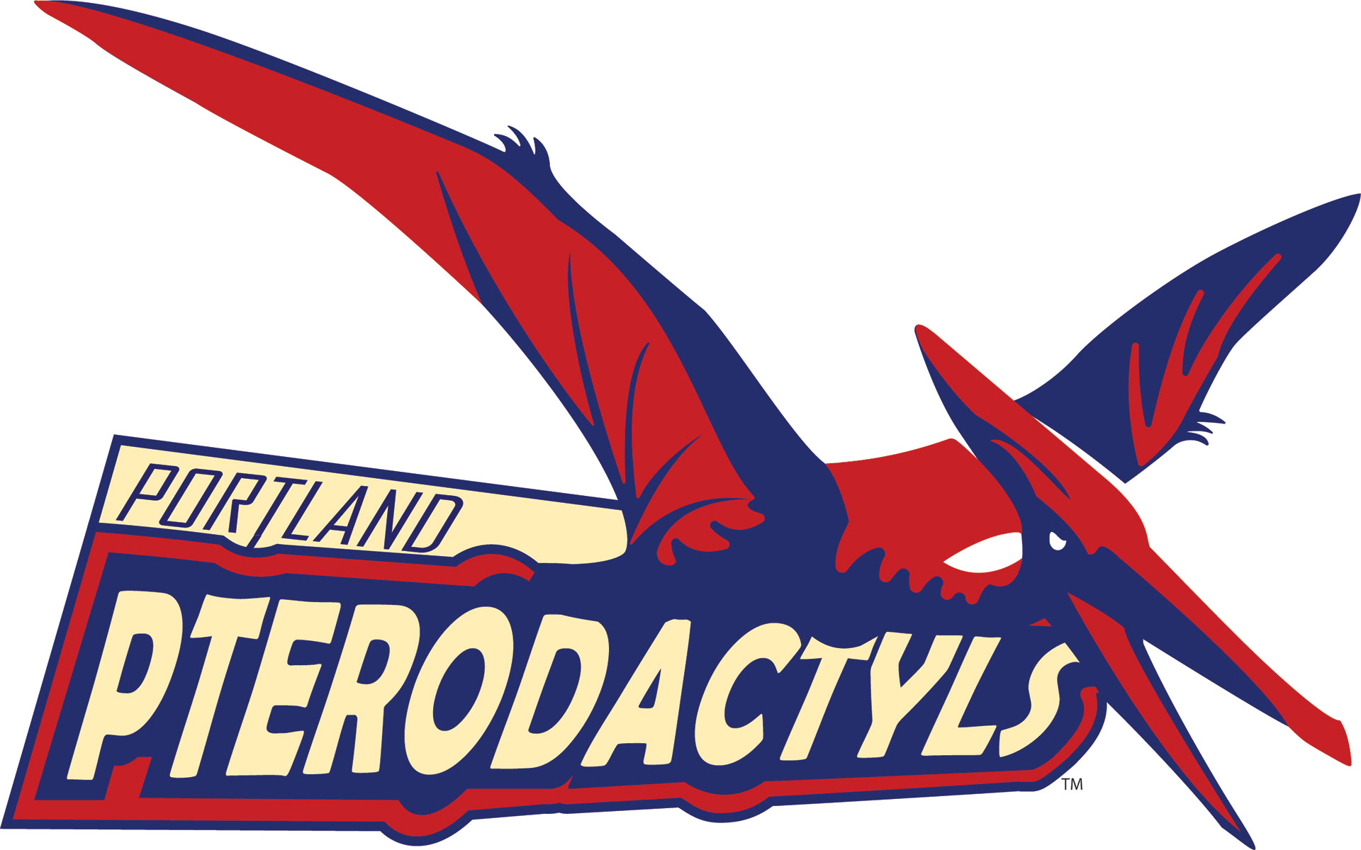
final logo for the kids league
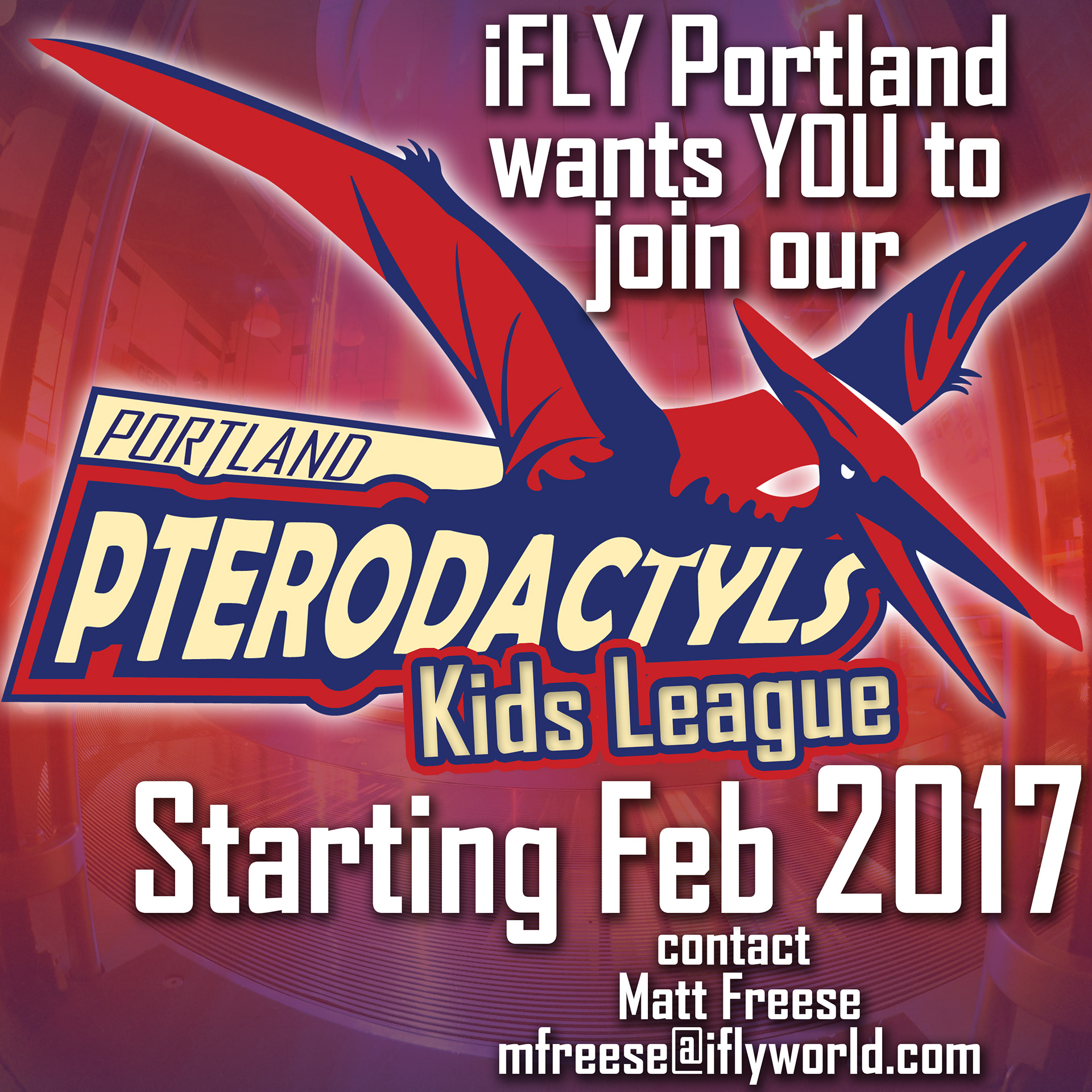
this graphic was used for social media posts