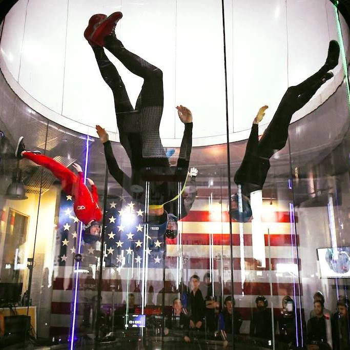
This project came together shortly after several friends of mine won gold at the 2017 Open National Indoor Skydiving Championships in Virginia Beach. They competed wearing scuba‑diving liners, and when they returned home, they asked me to help give their team a more professional, cohesive look. They wanted a design that blended themes of life, energy, yoga, and earth.
After research, feedback, and many iterations, we landed on a final piece the team loved, one that went on to become a defining part of their visual identity as they continued winning championships. The original wetsuit liners are shown below, worn by most of the team, with Cole standing out in red.
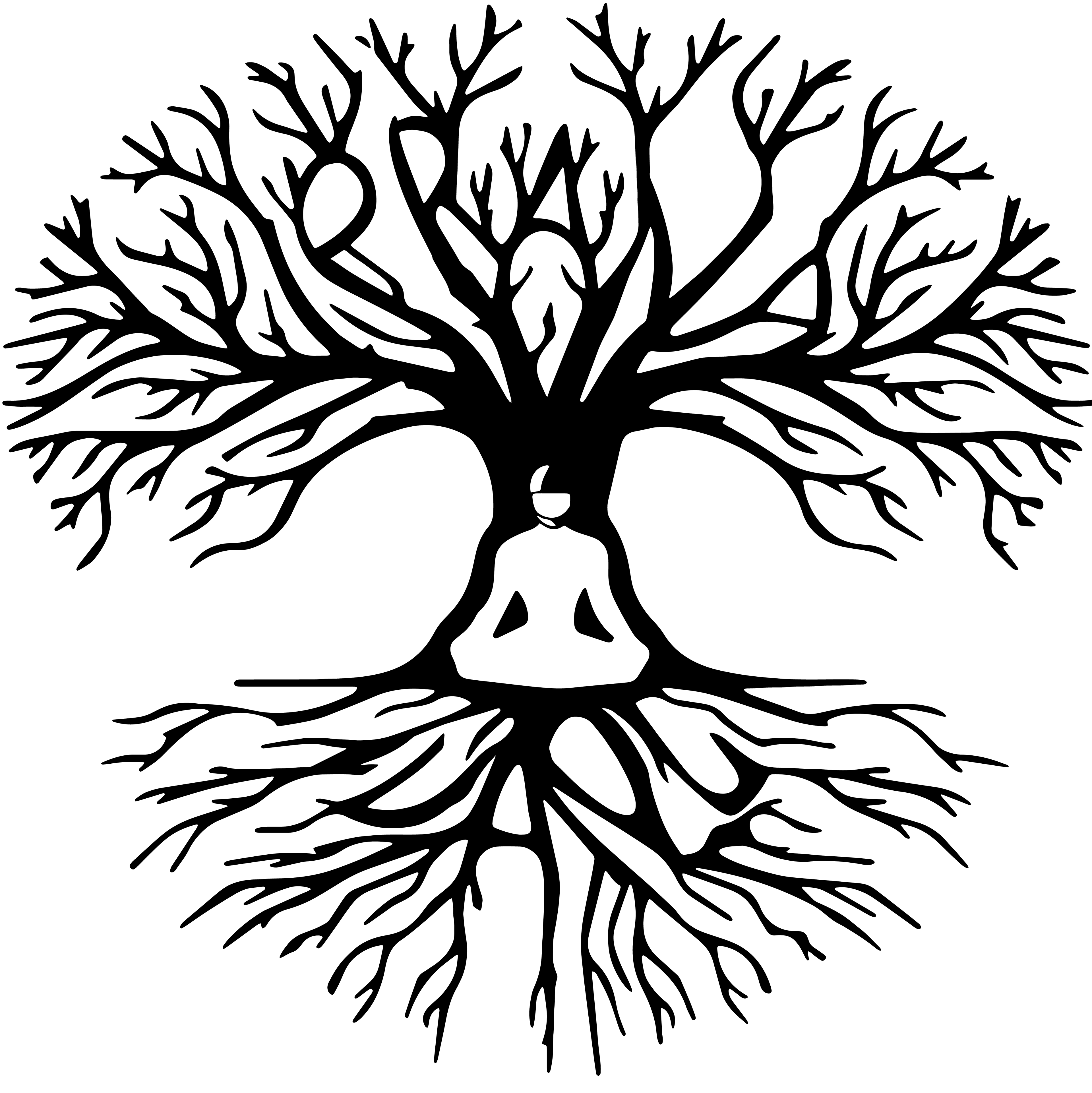
The project began with designing a team logo, something that could live on the suit, work as a sticker or patch, and still reflect the themes of flying and the energy of life. My initial concept featured a simple tree of life with the team’s initials on either side. After several rounds of refinement, the team and I developed the final version: a stylized tree incorporating a helmeted flyer at its center, with the team name woven into the branches.
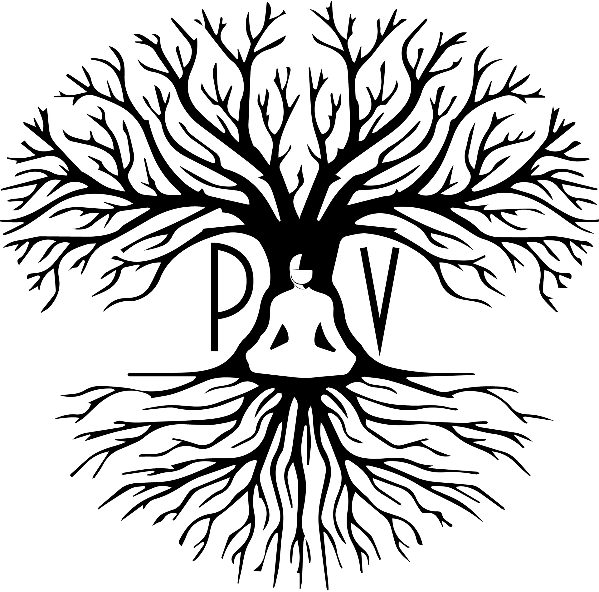
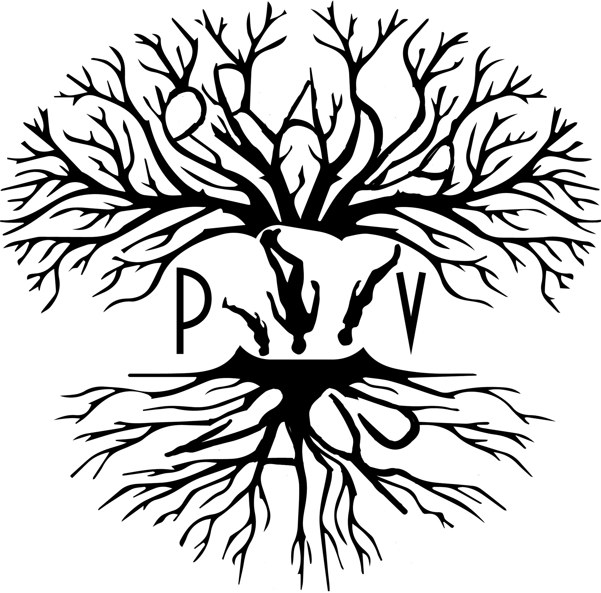
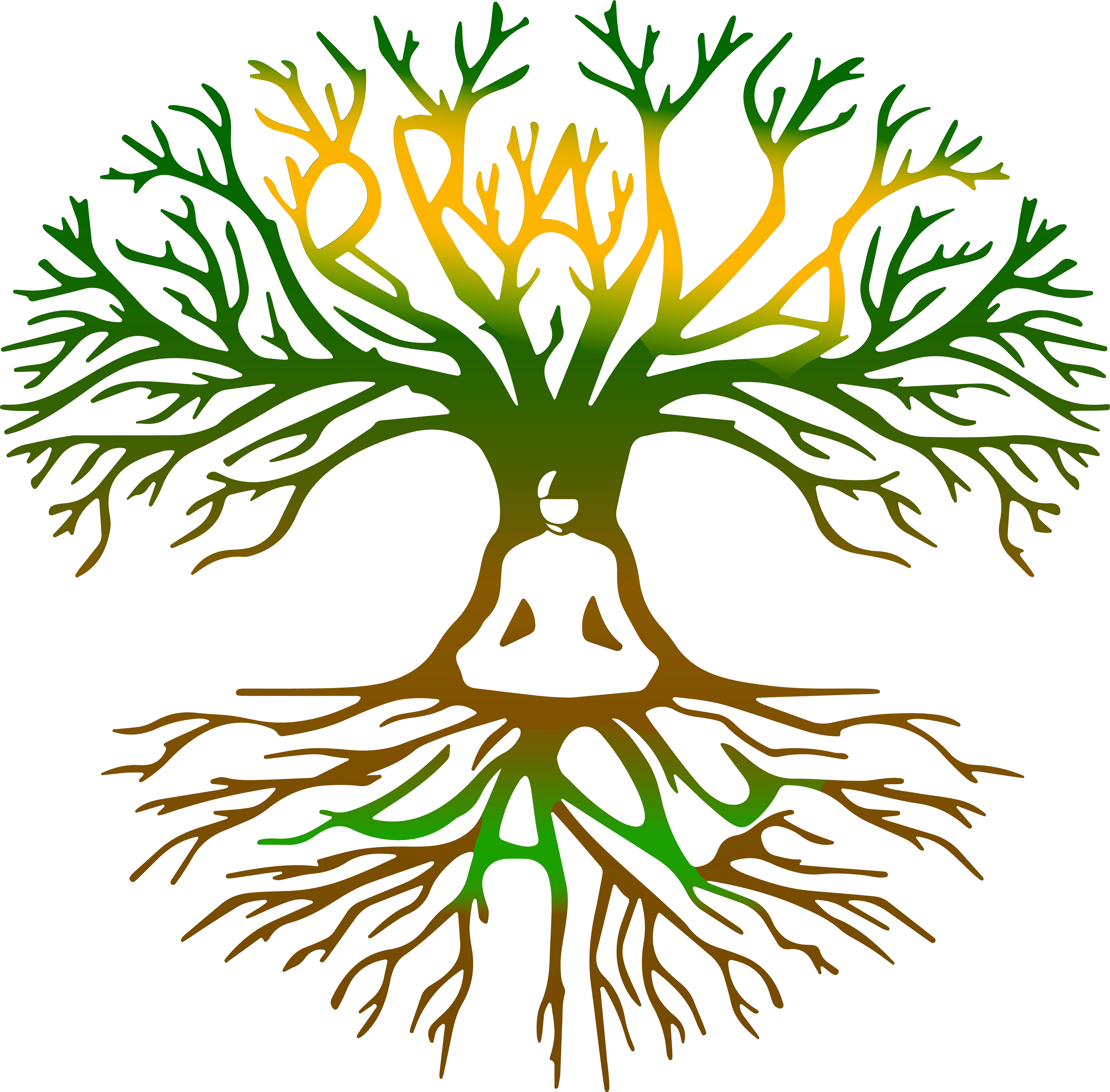
The final logo needed a defined color direction, so we chose earth tones with simple gradients to maintain a calm, zen‑inspired feel.

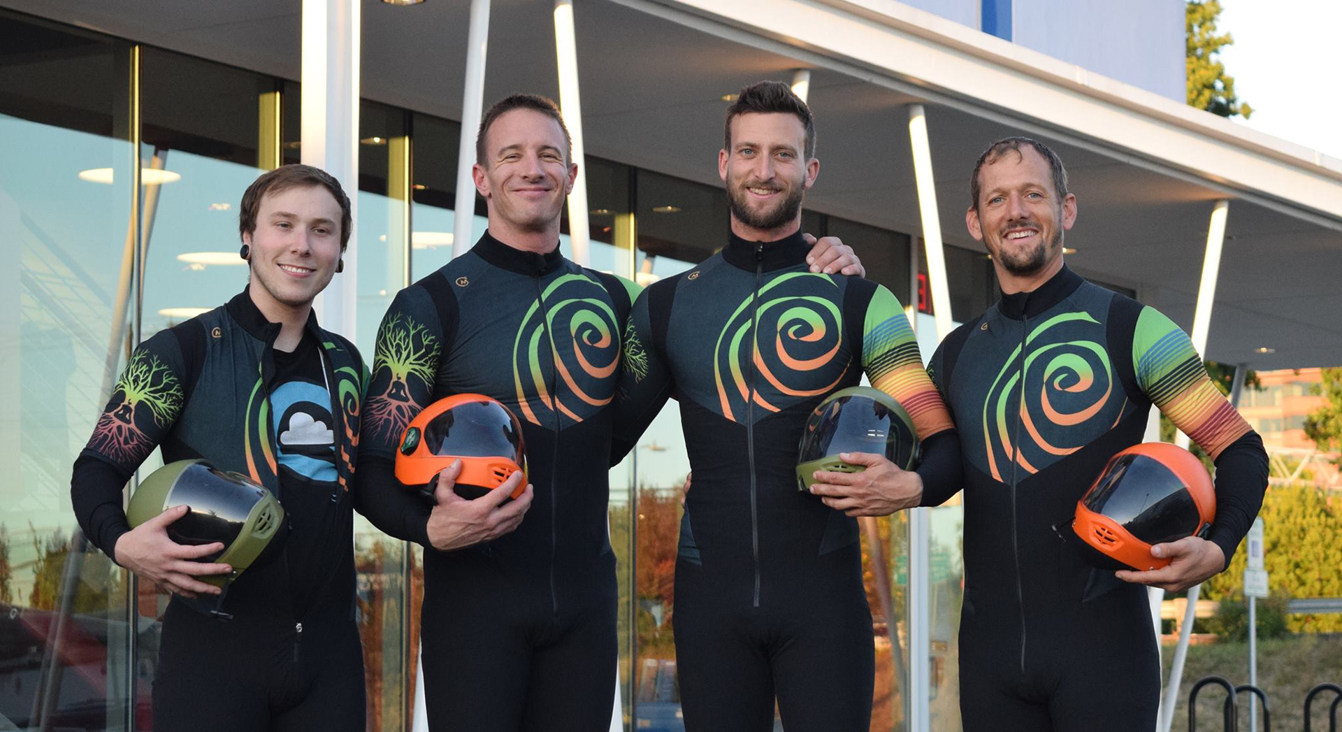
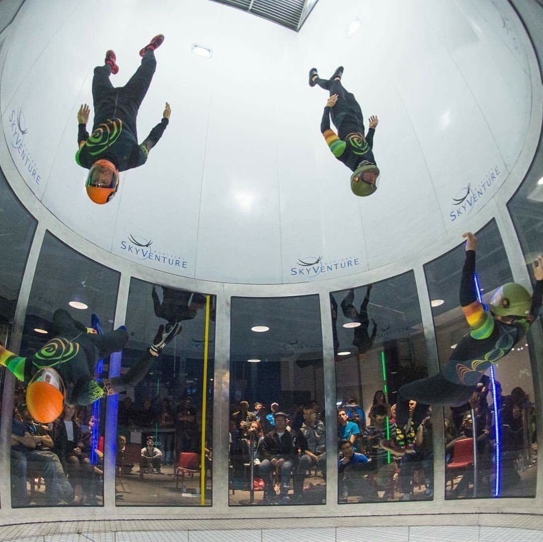
Once the logo was finalized, I moved on to the suit design. The color palette took some fine‑tuning before we landed on a combination that felt earthy while still complementing the helmet colors provided by the team’s sponsor. I incorporated the team logo, added chakra symbols down the back, and introduced a set of stripes on the left arm. Those stripes represent the team members and highlight the colors they wore during their first national gold medal win as a group.
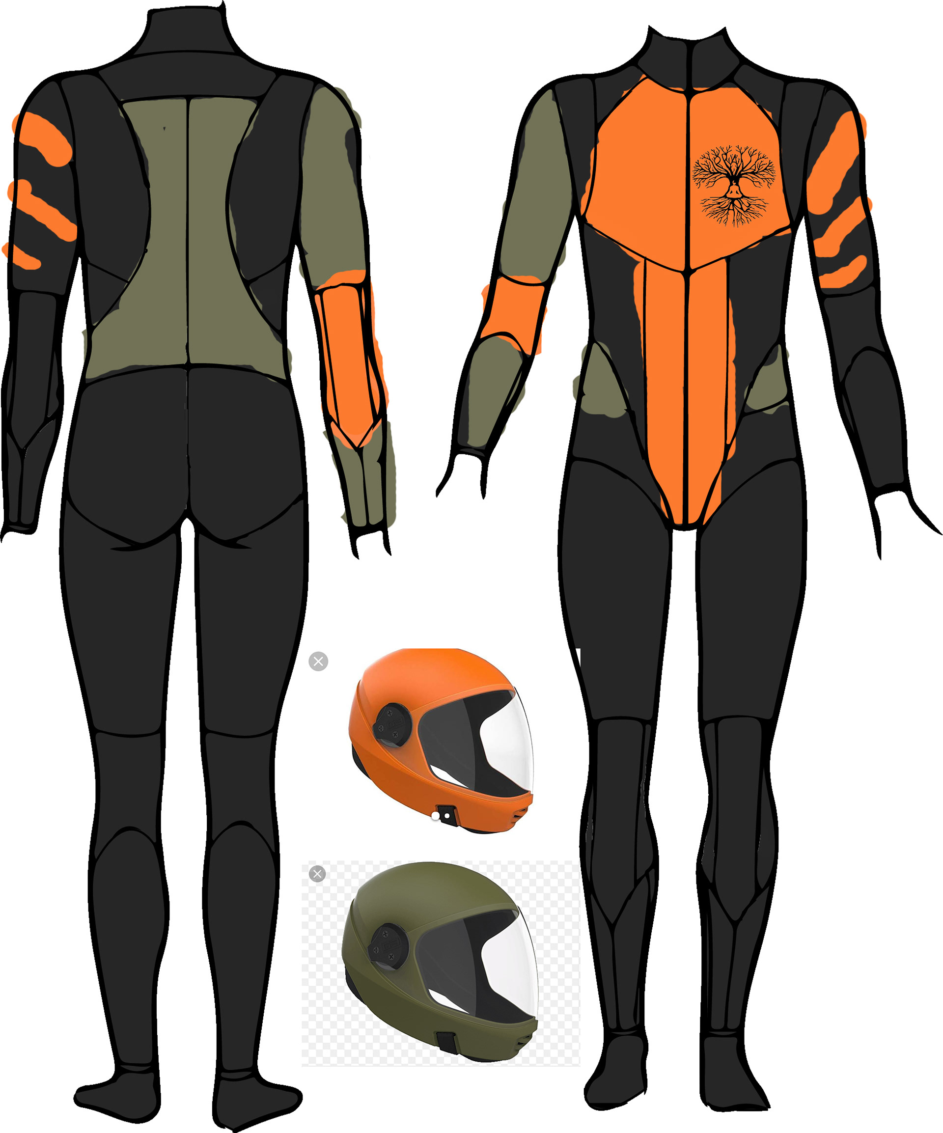
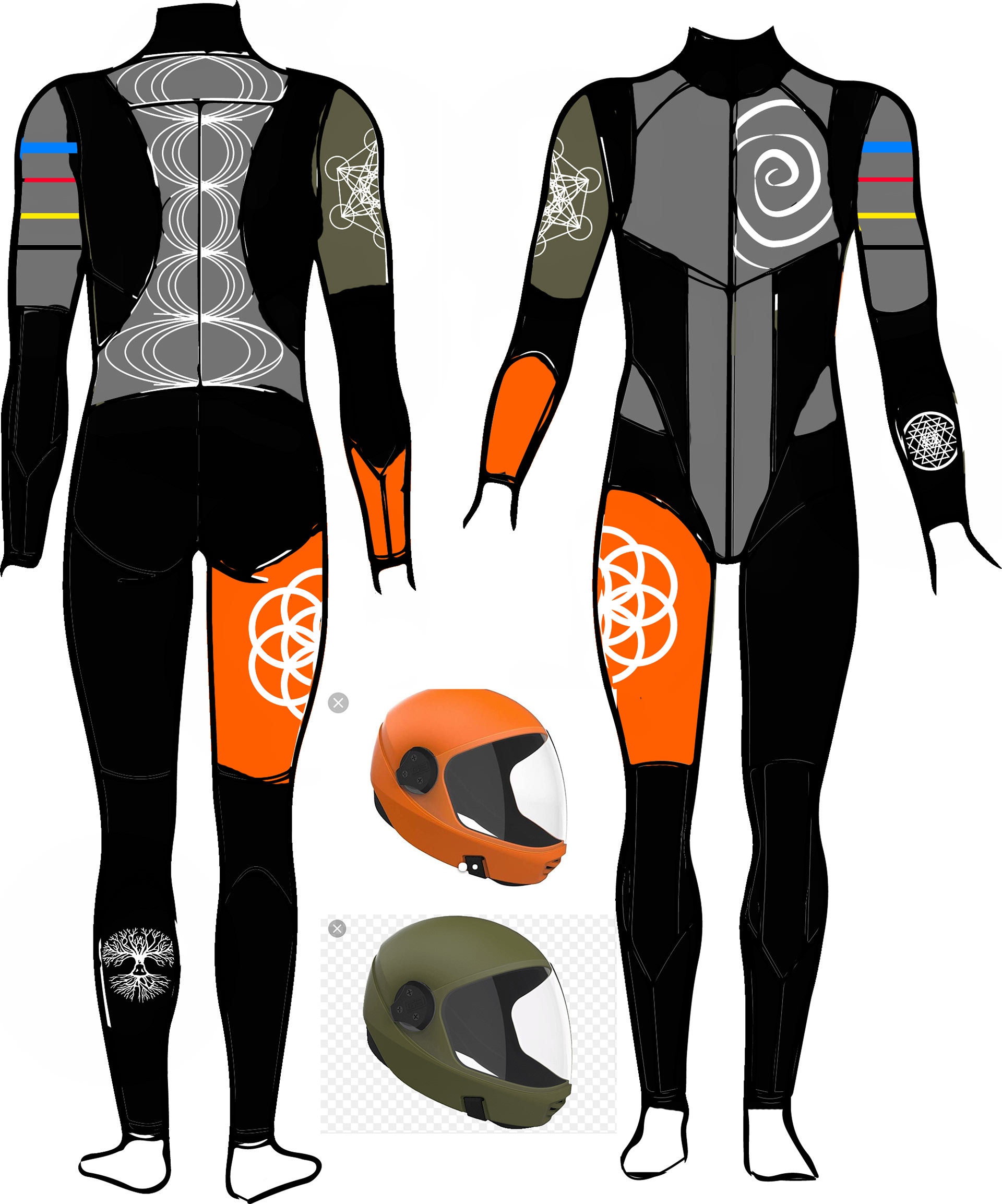
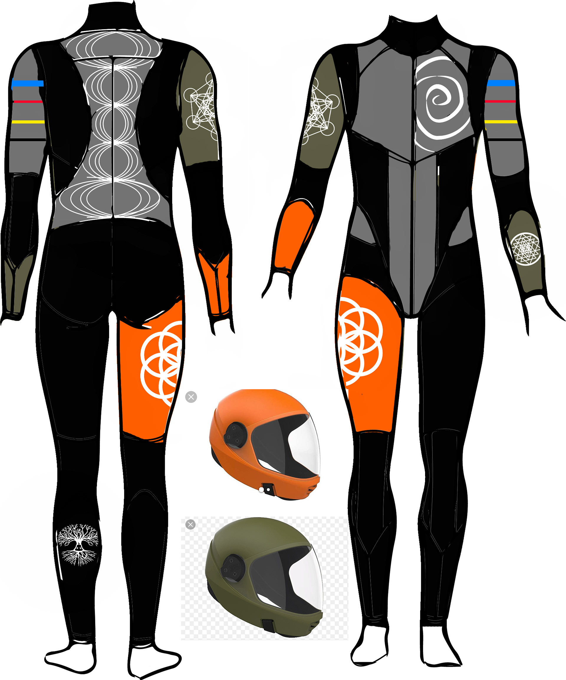
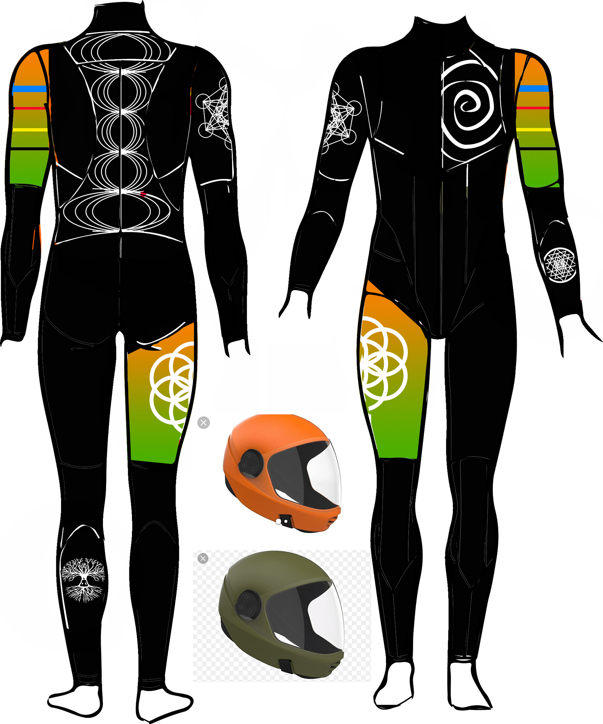
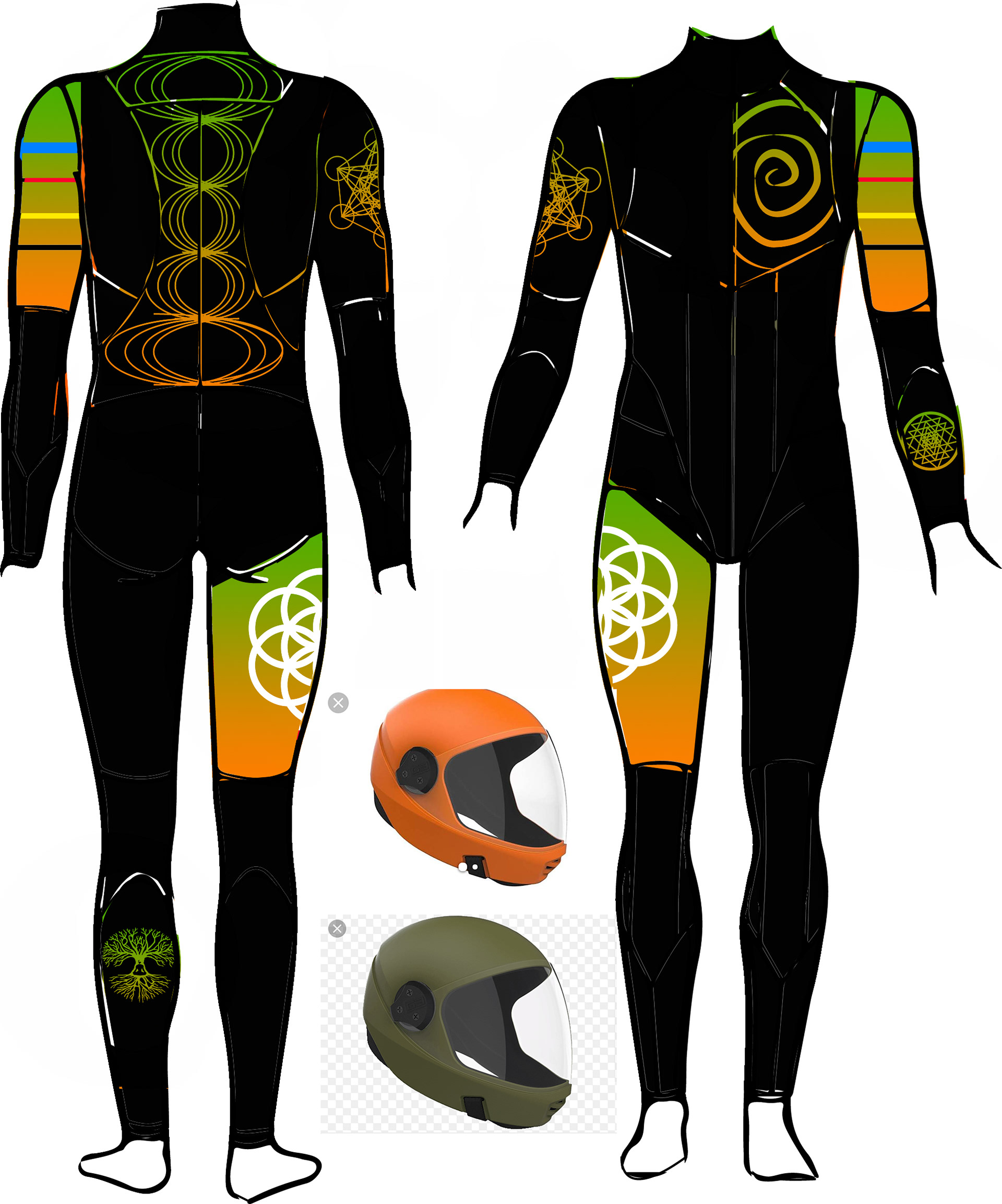
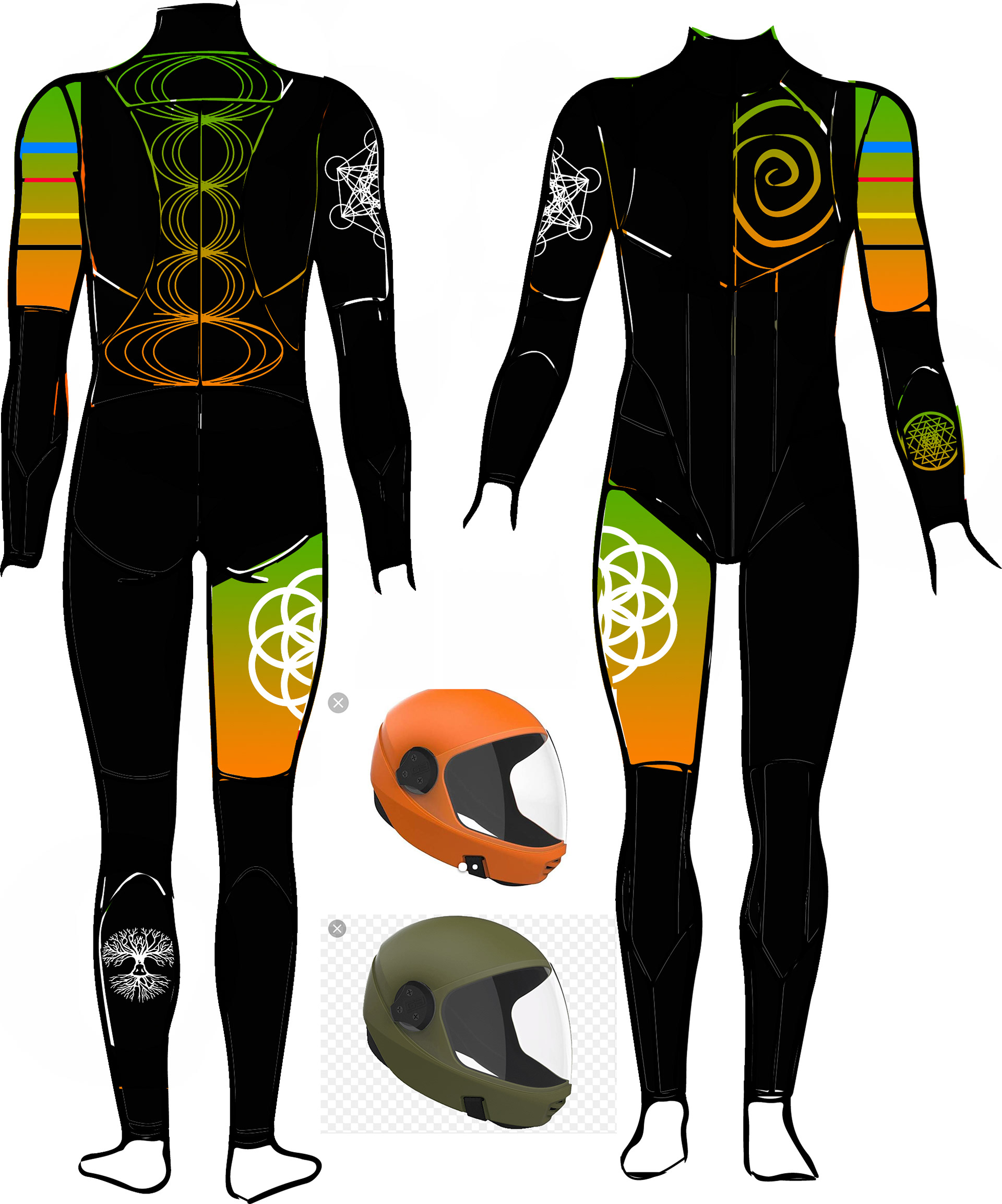
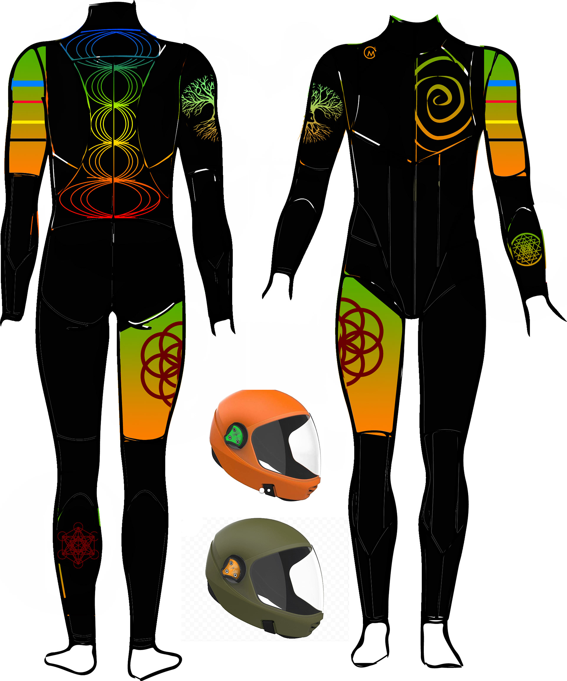
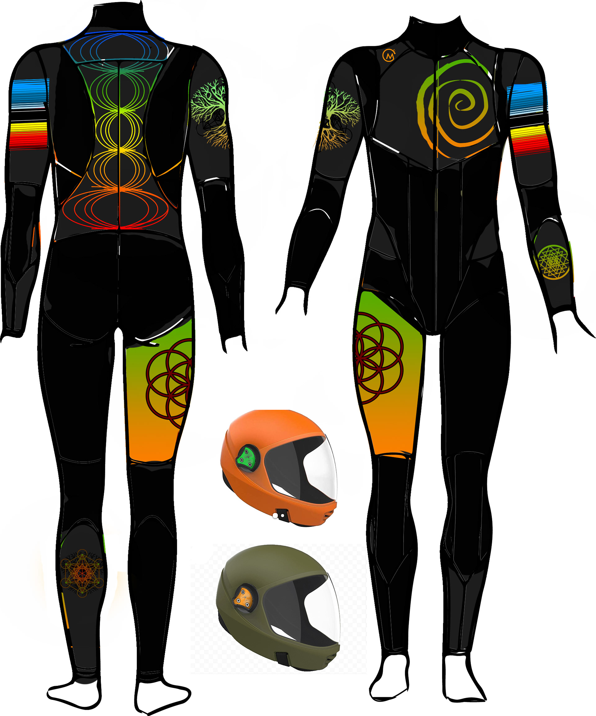
Boogieman, the suit manufacturer, provided me with their Marvel suit templates to design on. Their team worked closely with me throughout the process, helping refine and shape the final pieces to ensure the design translated accurately and cleanly onto the finished suits.
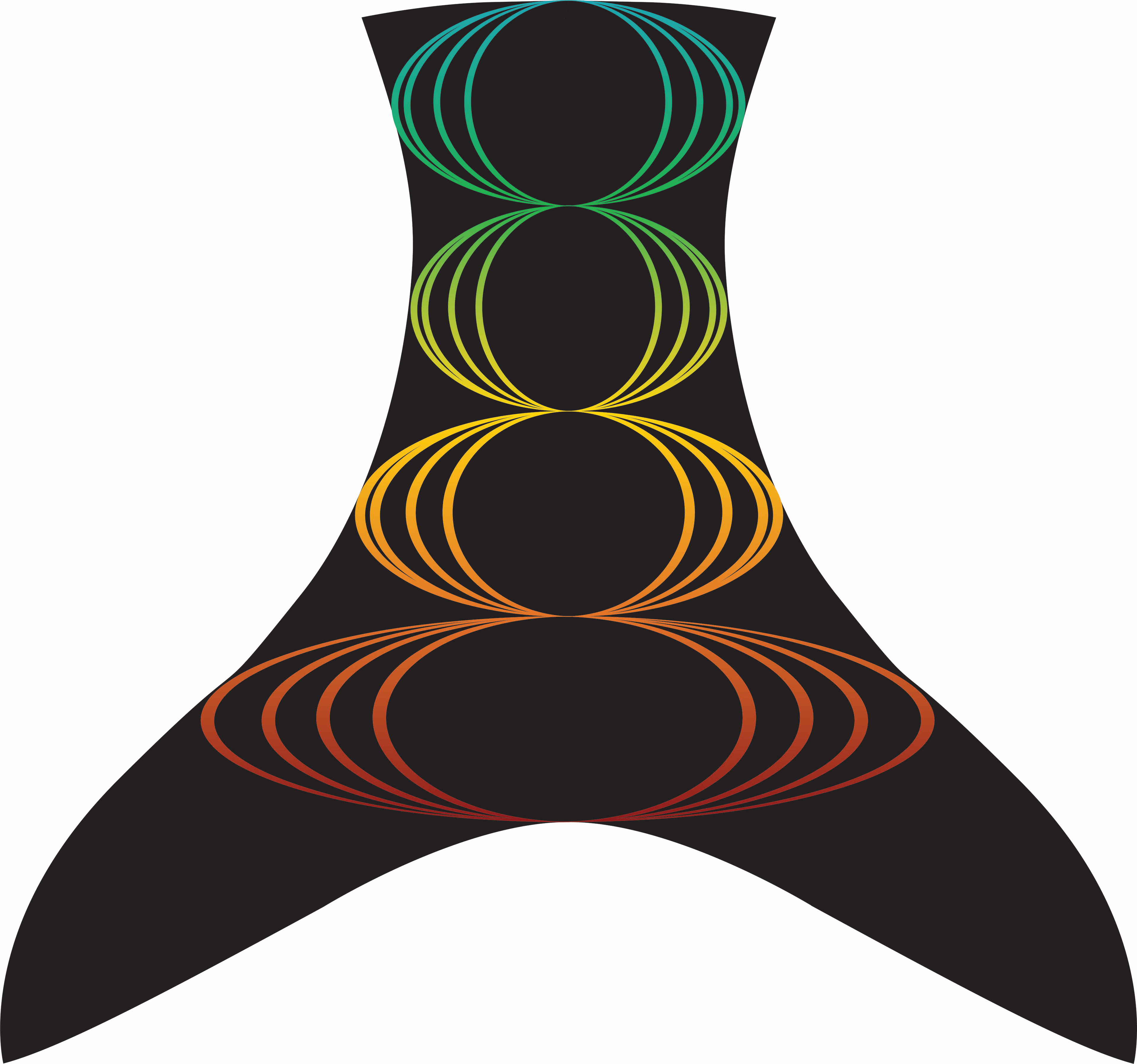
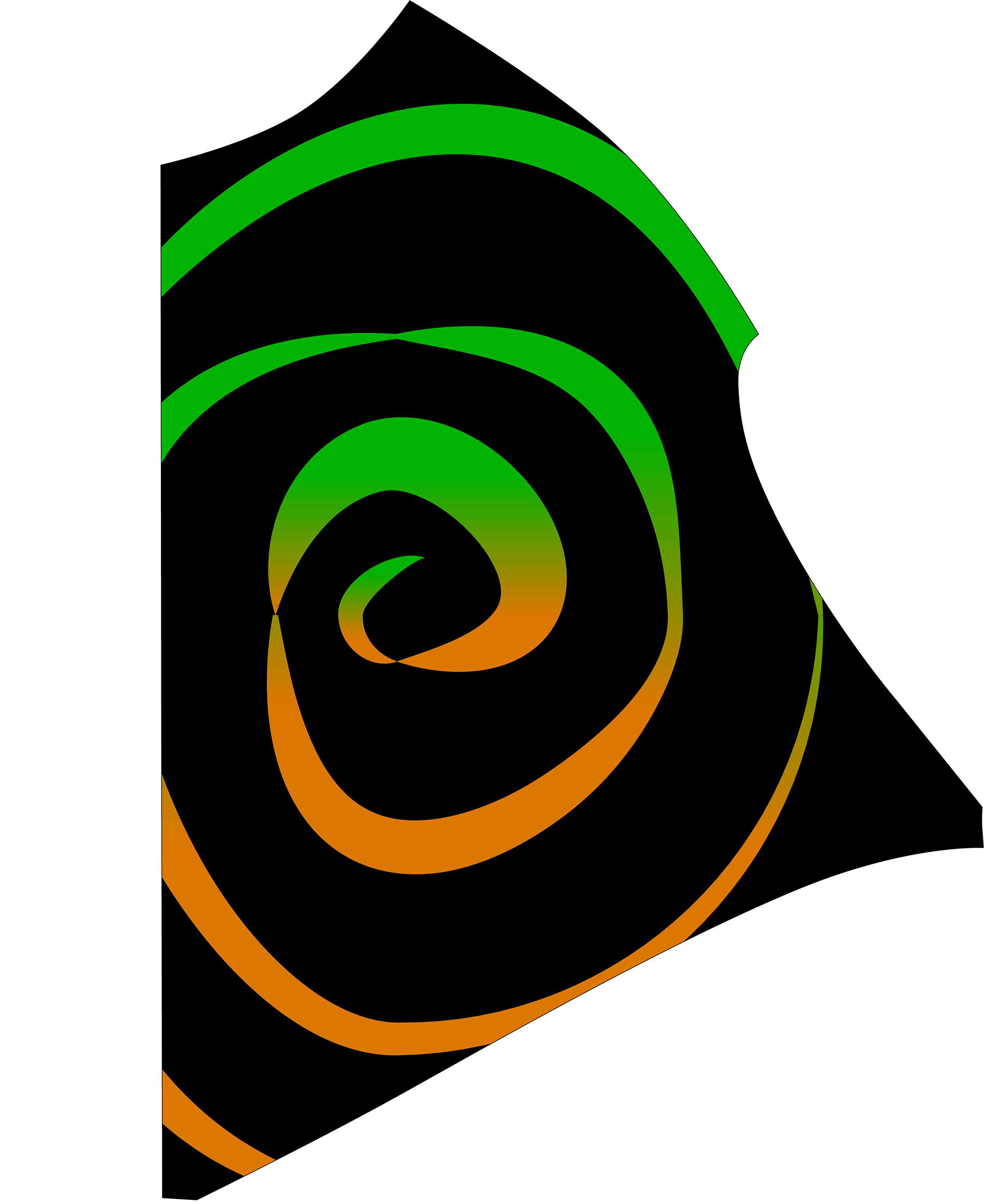
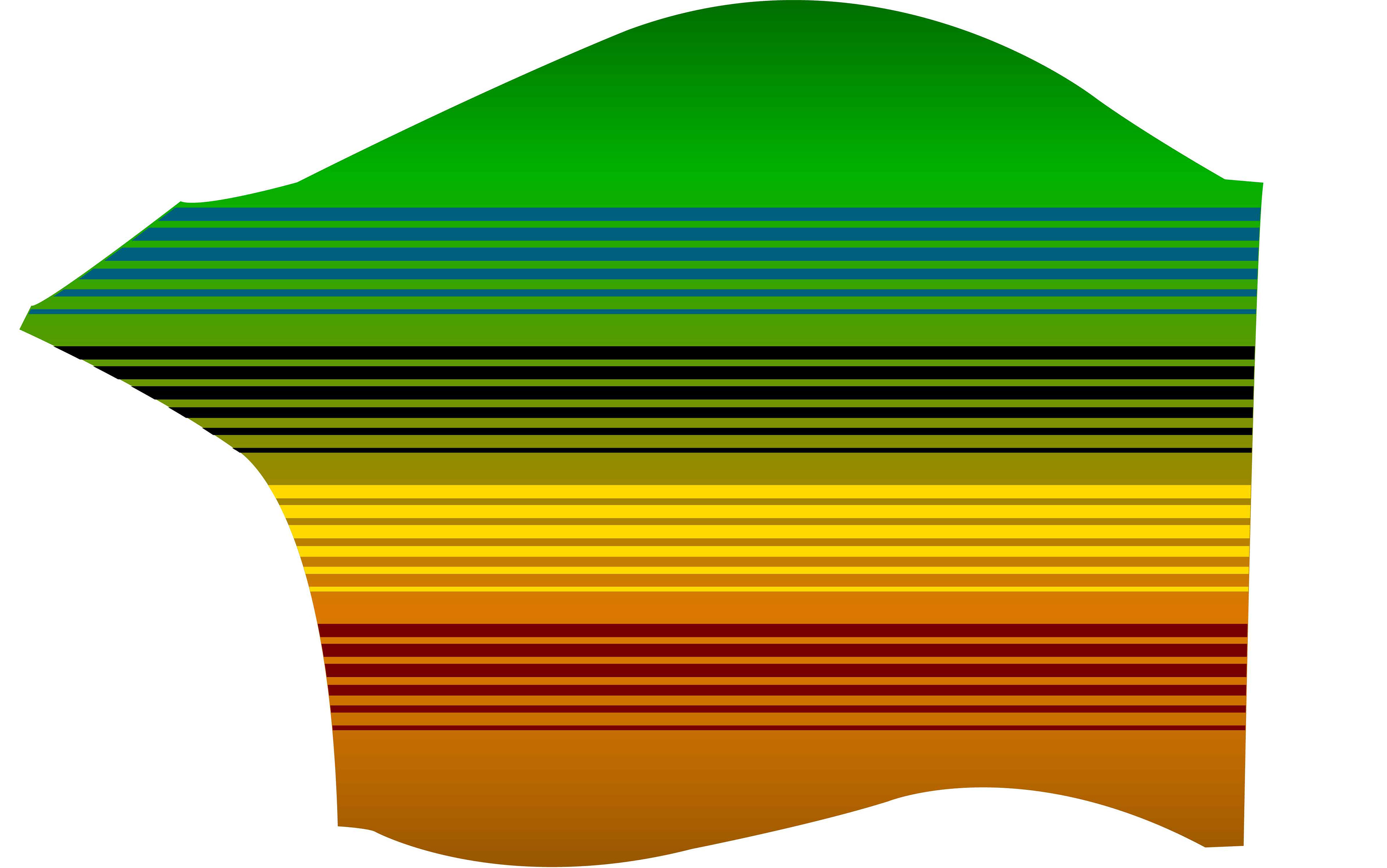

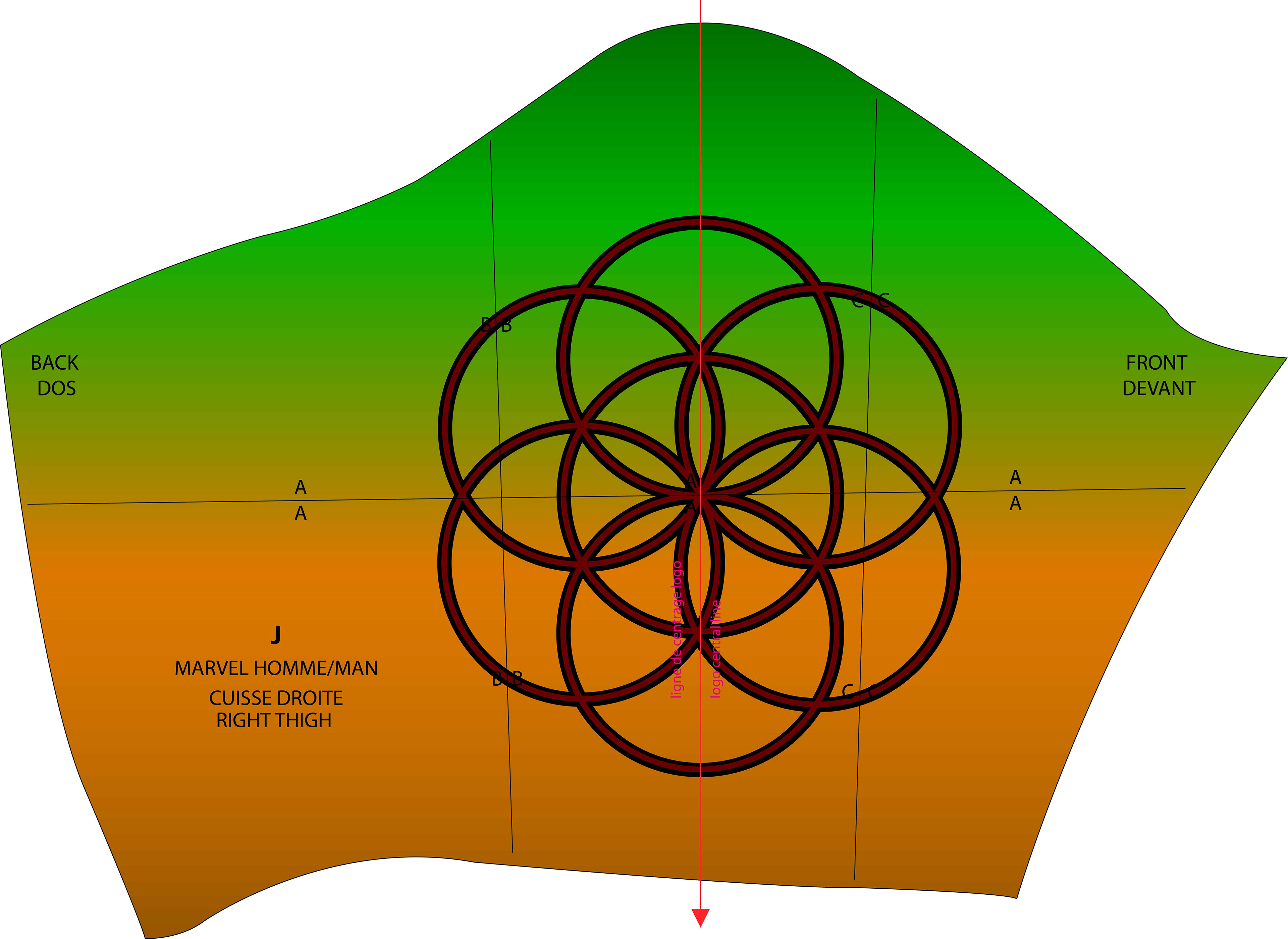
The finished suits came out colorful and vibrant, helping the team stand out against many other competitors during events. The final look reinforced their identity and made them instantly recognizable on the flight deck.
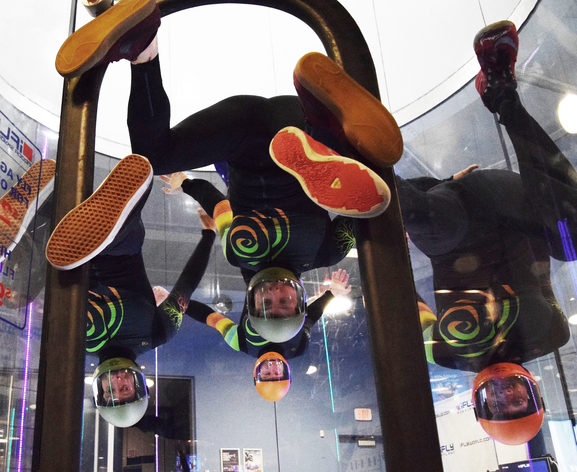
This video was part of a promotional series created for iFLY in the lead‑up to the World Championship in Montreal, France. It was filmed and edited by my friend Michael Cunningham, contributing to the broader campaign designed to build excitement and visibility for the event.